Website: adding a page for the project
In this blog post I will explain how I have added a page on my website for this term's project. There are a few things that are important when working on a website: keeping the navigation intuitive, making sure the viewer can always click out of the place where they are, aligning everything on the website so it is clear and neat, making sure there are no errors in both the desktop and mobile versions.
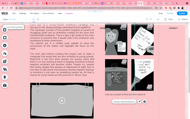
The first thing I did was to create a new page for my project and added it to the drop down menu on the portfolio button in the menu and I have added a strip for it in the portfolio page. I decided to make the page aesthetically similar to the other projects from this year so there is a general cohesion between all of the pages.
I decided to place it all in the way showed above because I think that this lets the viewer have a clear access to both the posters and the animation. I have also added some information about each poster in its description, but I knew it is not clear that there is some text, so I have decided to add a disclaimer to click on a poster to find out more about it. It is encouraging people to actually click and have a look at what I wrote about each of the posters.
In the gallery settings I was able to write a short description for each of the posters for people to access my clicking on a poster. I think that little explanation of my thought process gives more storyline to the image and gives it more life. I think it makes it more interesting.
This is how it looks on the website when clicked:
I think the fact that it is possible to enlarge the image and also read some more about it only adds to the campaign in general. There are also buttons to click through other posters from this point and a cross to close the window and go back to the project page. I think it is good I have added the information that it is possible to click on a poster to see more because I do not think it is something completely clear and obvious.
I also needed to create a separate page for my 3D piece and link it to this page I have created.
I decided to write a very short introduction to the model and put the GIF next to it and then put the four images in a gallery at the bottom of the page. I wanted it to be a different gallery, not a one so simple I used in the main project page, but something more interesting. After exploring different options I have decided on the 3D carousel gallery.
I think this kind of gallery makes the page look really modern and interesting. The carousel goes around every 30 seconds, but a person can also click on the next image and then the images change order. Also I have enabled the option to enlarge the image when clicked, so people can see it close up as well. I have written about that in the project description as well to make sure it is clear to everyone that there is a possibility to enlarge the images.
At the bottom I have created two buttons: back to the project and back to portfolio. Back to the project takes the user to the project page and back to portfolio takes the user to the portfolio page where all 3 projects are listed.
I think the website looks great with the project on it, but I will send it to a couple of friends first to get some feedback from them on how it looks like and what they think about the navigation.


Comments
Post a Comment