Posters: finalizing
In one of the posts I have posted recently, I have explained my planning process for the posters. I have gotten inspired by the Samaritans campaign and decided to create the posters with some hand-writing on them, to make them more realistic. I also decided on making them black and white so the theme of my project: 'Ultimate Black' is really highlighted. I wanted to emphasize the importance of the topic and I think black color really does that to a work because it is a serious color and it adds seriousness.
I have decided to lay the sketch for my poster at the bottom and lower the opacity of it and then draw over it.

I decided to work on a strictly limited color palette that would include only blacks and grays. Above I am presenting on the screenshot, how I approached the face of my character. I needed to make sure the lines were smooth and there were no rough edges.
I was using a brush called Syrup but this brush causes a problem. Whenever I was filling in the color with a bucker fill it would leave a very thin line between the area and the outline that would not be colored.

That problem is presented on the screenshot above. I could have tried to color the line in, but it is impossible to make the brush so small so I would interfere with the outline's smoothness. I was not quite sure how to overcome the problem at first, but after some thinking, I decided to create another layer and place it underneath the layer with my drawing and fill that layer in with the colors I wanted to appear in those lines. This was an idea that solved my problem. It worked perfectly and it once again shows how I really started to use layers to improve my work.

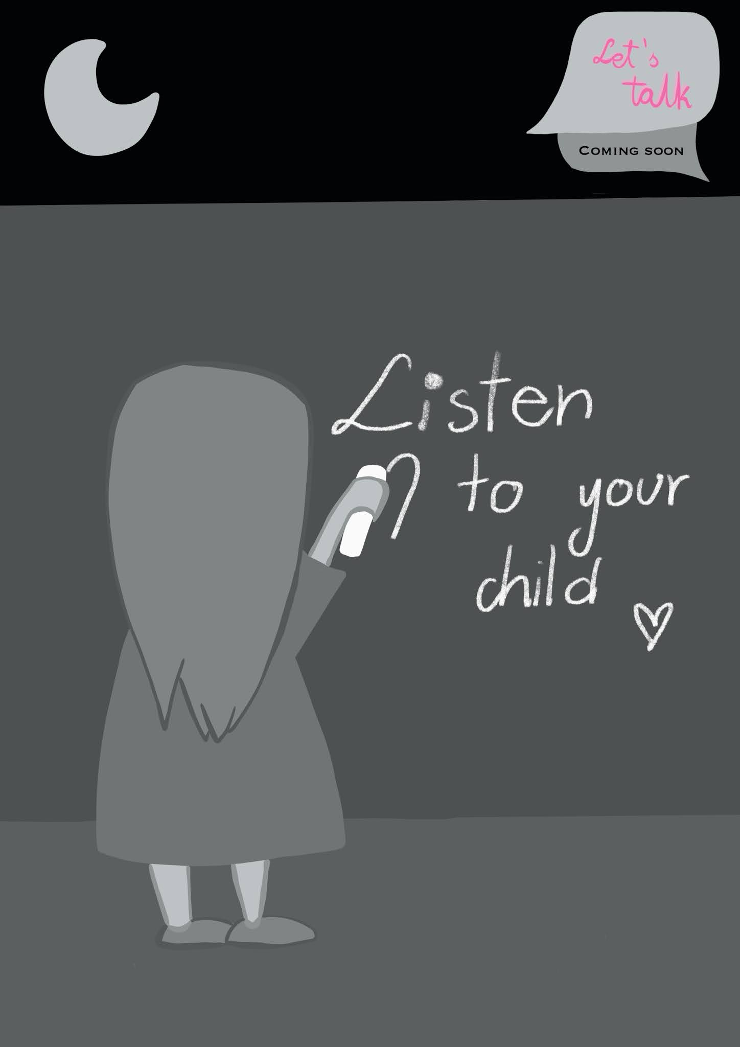
For the hand writing, at first I wanted to make it really pretty and aligned perfectly, but then I really thought about it. What did I like about the Samaritans campaign? I liked that it was real. It was not staged by someone. This is why I decided to abandon the idea to make it all perfectly clear. I wanted it real as a teenager in a crisis situation could possibly write. This is why I decided to use my own messy handwriting and not think too much about whether the letters are aligned perfectly or they have the perfect shapes.
Here are my finished pieces:


The fourth one is the most effective to my mind - we can talk about the text in our tutorial on Monday.
ReplyDelete