Initial sketches - pet dinosaur
In this blog post I have decided to show my initial sketches for my last character - the pet dinosaur. I decided to create four very quick and rough sketches of the character to kind of see how I can present it. It turned out to be a lot bigger challenge than I have expected. I have never drew a dinosaur or a creature similar to one and I noticed I do not have a lot of experience in creating a character that looks like that. It made it very difficult for me to even come up with ideas.

This is a very rough sketch of an idea and I think it looks fine. It is sort of complex for a pet, and my plan was to make the pet character very simple so it does not take any attention from my main characters. I based this character on circles to it looks friendlier and I have added the awareness ribbon that I have mentioned in my purple color research. I am generally happy with this sketch but I am worried it may be too complicated for a pet.

This next sketch is not very successful. I would tag it 'a mistake', but mistakes are important, it is why I am even adding it on here. Firstly, the feet are too big and they are in a very unnatural perspective. The arms are too high up the body. They should be at least a centimeter down so it does not look odd. What I like about the image is the nose. I think it looks quite great, but the rest of the sketch is not very good and exactly like the one before, I think it is too complex. For the next sketches, I decided to take all the complexity aside and try something completely new and see how it turns out.

This next one is definitely different. The whole body structure changed and I am not sure whether I like it or not, but I like that it is simple. I do think the feet are far too big and they would need to be smaller, and that the arms should have elbows. Those are mistakes, but the fact that I am able to see them and comment on them makes me very happy. I think this one looks extremely friendly and I really like that, because this dinosaur should not be scary, it should be sweet and friendly, maybe a little bit goofy. I thought it could a good idea to make the head possibly less rectangular and more circular to highlight the friendliness of the dinosaur. This is what I decided to do with my last sketch.
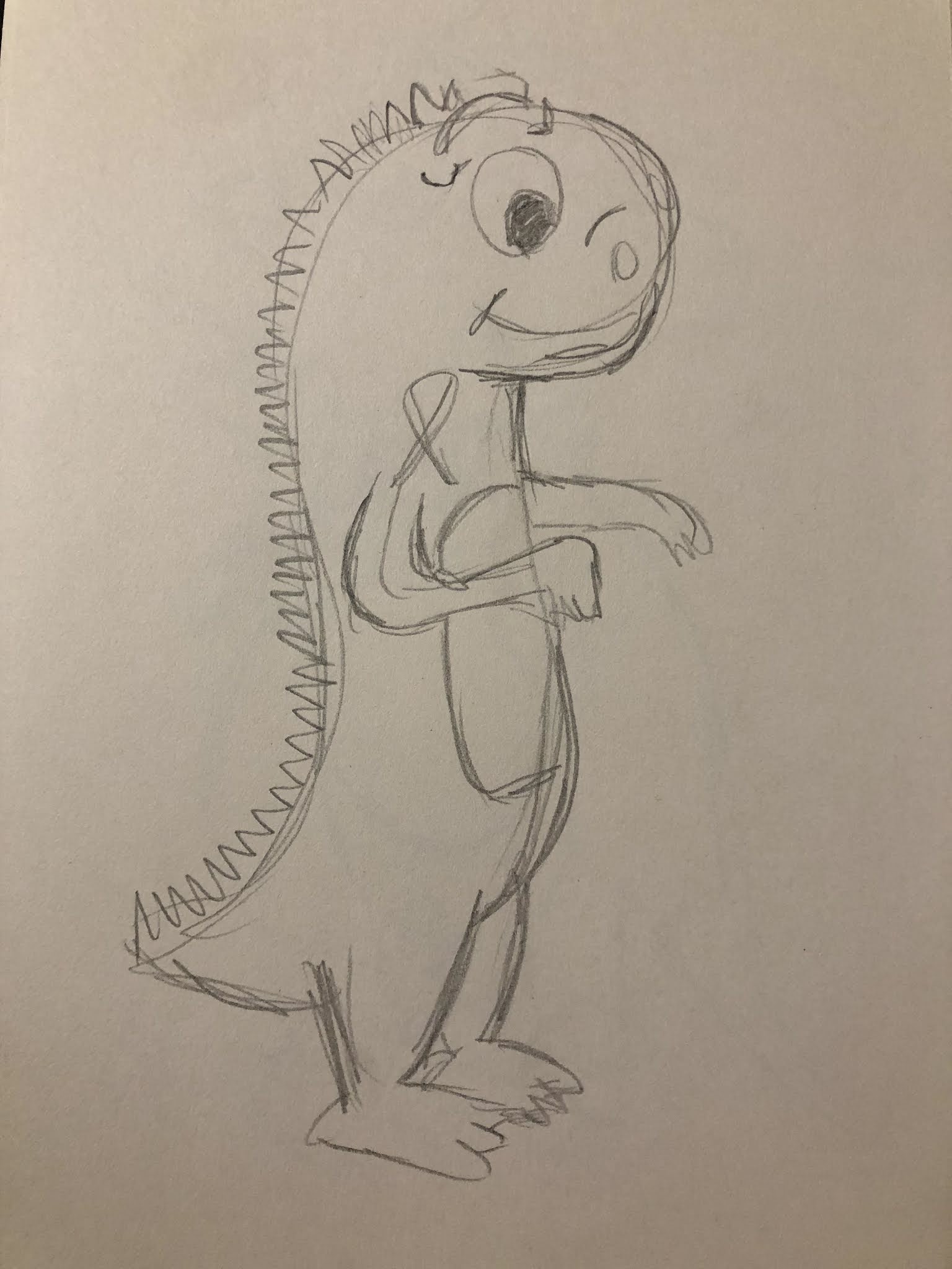
I think I overcomplicated this one with the little wrinkles on his face. I also think the arms are weirdly long and this is not exactly what I was thinking when I thought of arms with elbows, exactly when I can tell there is no bone structure in the arms. They look as if they were very jiggly and that is not what it should look like. I do think that the general shape of the dinosaur looks better this way, but doing a lot of small spikes on its back was a mistake, I think I should stick to less but bigger spikes. I like this sketch but it does have many mistakes that I need to work on.
I am generally very happy with my development process for the dinosaur, especially keeping in mind that it is a completely new sort of a character for me. I definitely struggled with creating anything that would look anything like a dinosaur but I think those four sketches look like dinosaurs. In each of those sketches I was able to spot mistakes, but recognizing them will help me avoid making them in the future.


Really like these sketches, particularly the first one - much rounder, closer to your appeal to your stated target market. This is the most successful one so far, well done.
ReplyDelete