For grandma's character I have created a bunch of sketches and my tutor commented on them, letting me know which of the sketches he liked the most. I agreed with his opinion and decided to make a few minor changes in the particular sketch and add colors to it.
This is the sketch I decided to go for, but as I mentioned in my sketching post, I did not think this grandma looked wise enough. I wanted to make her look more serious. I decided that in this case I want to use color, not physical features to make give her more seriousness. When I was finalizing the character of the mom, I have used split complementary colors, it was my way of showing that chaos surrounding that character. This character is a lot calmer - much more serious, so I would not use split complementary colors or complementary colors. I decided to use analogous colors, because that would make the character a lot more balanced. I think playing with the color in this case was extremely important.
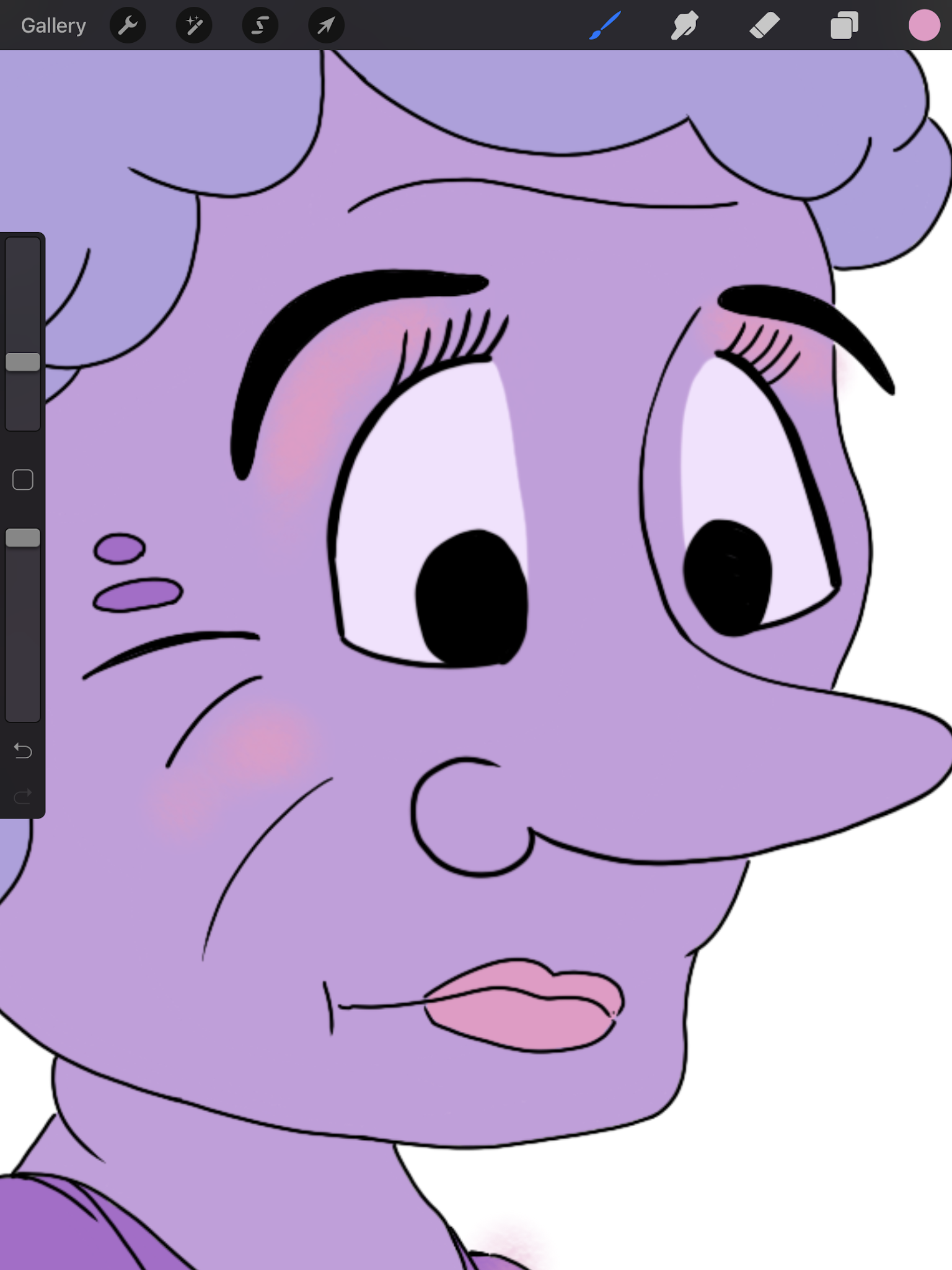
For the color palette, I looked at the color wheel and took the two colors that are next to purple, in the same shade I wanted to use. I also decided to make the dress darker purple, because the grandma is a widow, and widows in Thailand wear purple. At first I was thinking of making the dress pink, put then I decided on making it really bright purple. I knew coloring this entire character in those very dark almost 'heavy' colors, would not be good. I want to give this sensation feeling full and almost overwhelming, but I realize that it could be too overwhelming. I know this character has pearls on their neck and earrings. I decided that these elements are going to be the ones that stick out - that keep the balance. I decided to make them the pearl-like beige color, which would definitely contrast with the overwhelming amount of purples.

This is the color palette I established for this character. The light purple went for the skin color, the purple-blue went for the hair, the pink went for the shoes and make-up, the dark purple went for the dress and the pearl color went for the pearls and the crown. I am very happy with my thought process. Before establishing this exact palette, I had given a shot to some other ideas which will be shown in the video at the end of this blog post.
As I mentioned earlier, I wanted to make a few minor changes in this sketch. I was making those changes while tracing the sketch in the app called Procreate. I created the first sketch with the brush called Peppermint and then I cleaned the sketch with a brush called Stylo Technique.
What I made sure I was using was the rule of curves against straights.
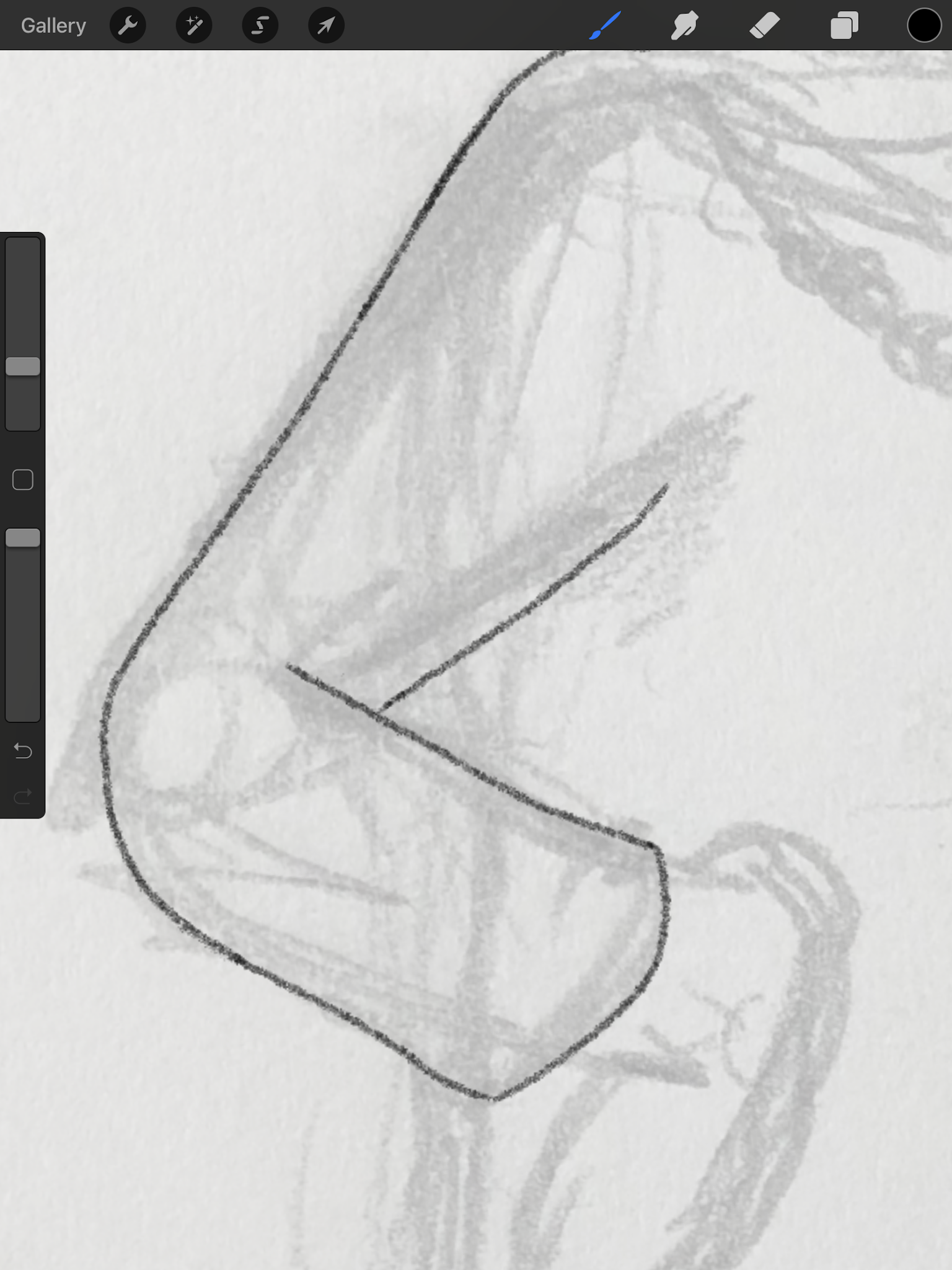
Here while working on the sleeve, I used this particular rule to show the bone structure of the character. The straight line on top of the sleeve shows that this is where the sleeve rests on the arm and there is a bone. The curve line shows that the sleeve doesn't touch the arm in that spot, it is just hanging. Using this rule is very important when creating characters, because it makes them more 'real' even if they are not realistic.
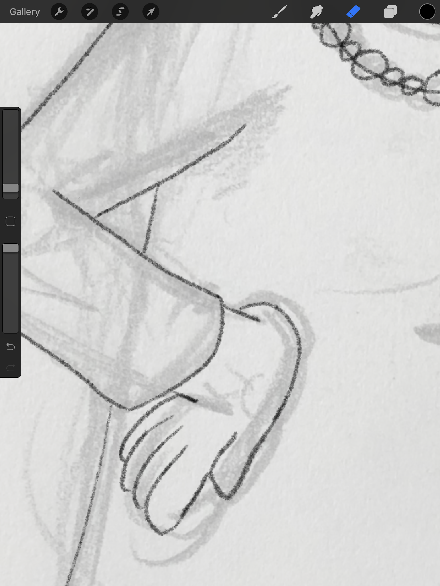
Another thing I really had to work on was the hand. I generally do not really like drawing hands, because I find it challenging, but challenges are important, because without them I would not evolve as an artist. When creating rough sketches I never pay attention to the fingers, I only make the hands look like mittens. I have learned that this is how character designers do it, because apparently fingers are difficult for everyone - not just me.

This is the hand during the process of creating. I highly did not like it and had to make many changes to it to have it acceptable. As a reference, I used my own hand and tried looking at it and how it looks when I have it on my hip or my waist. I wanted to see how those fingers naturally lay because what I created here was far from natural. It was a mistake, but mistakes are important.
Another mistake I found was a point being very close to being a tangent point.
This point in the dress design is very close to being a tangent point. When creating the character of mom, I have explained what is a tangent point and why it is important to avoid them. This point is not a tangent point exactly, but from afar it does look like a tangent point and it is highly important to avoid them. I solved this problem by simply moving the upper line a little bit to the side. I am glad I once again, was able to spot a mistake like this one and was able to overcome this issue.
What I also changed was the spot of where the crown is.
I decided to change the place to make it more 'in the back'. Thanks to this change the head looks more real, even though it is a cartoon character and there is not much realism in it.
The next step was coloring the character in. For the coloring I used the brush called Plume Studio. Most of the elements, I have colored with the possibility of 'bucket coloring' which is well known in all softwares. It means I colored the sides of an element and threw color inside of that outline, so I would save some time.
My tutor told me that maybe more color on the face would make the characters more appealing. I do agree with that and this time I decided to add some more color, it is still not as much as I would personally like to add, but it is stepping outside of my comfort zone. I decided to give my character some make-up, because she is a diva, a person with life experience and money. She needs to look like a real queen.
I have taken this screenshot before adding all the shades to the face, because I like to add shades last.
For the make up, I used a brush called Rough Skin which worked a little bit like an air brush and that is the effect I wanted to get. When coloring, I was really happy I decided to add the contrasting color in the jewelry, because just like I assumed the character overwhelmed me with the amount of deep 'heavy' colors. It gave me that sensation of having a breathing difficulty, and that is generally what I wanted to achieve, but not as much.
The jewelry really did contrast the rest of the image and I am really happy about that. It definitely worked well and it did what I wanted it to do. I think it was a successful choice.
Here is a video showing the entire process of creating. It is a time-lapse video I did in the app Procreate.
The video explains well how the character was created and shows my work process.
Of course, I will place this character in an environment, she will have a background that suits her personality. I think that is really important, but that will be in a different blog post. Here I just wanted to show the process of making the character itself.
The last thing is picking a name. As I said in my previous post, when creating a character of the mom, I want the names to have meaning - something to do with the character's personality.
I started this brainstorming process by thinking about wisdom and what words make me think of wisdom. I had many ideas, I checked the word 'mind' and 'brain' and 'wise' and 'knowledge' in many different languages, but nothing really sounded right for a woman's name. Then I came across the word 'philosophy' which ties well with this character. I checked it in different languages and once again Spanish did not let me down. Philosophy in Spanish is filosofía. The ending of the word sounds almost like Sophia, which is a real name. The name Sophia actually means 'wisdom' but I did not want to give my characters normal names, but something more interesting it is why, I think filosofía is a good idea for a name.
Here is my final drawing of Filosofia:
I am very happy with how it turned out. I like the contrast. I think it is overwhelming and serious and that all is thanks to the colors I used. I am happy with the work process and I think it is a very appealing character.


You refer to purple being worn by Thai widows - it would be useful to include an image that reflects this. Include the image reference you used for the placement of your hand. Good thought process regarding the name, it suits the character.
ReplyDelete