During today's Digital Arts class, we had to look through Wix website templates, look at the ones we like and pick a one that we want to create a website on.
The three I liked in particular were:
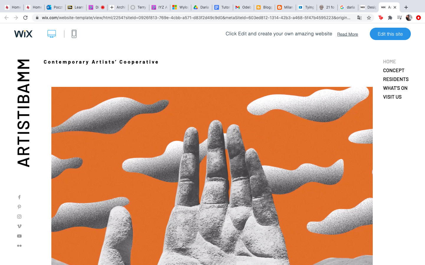
The first one is called: Artists Cooperative.
I really like the font used in this template. I think it is very artistic and reminds me of a poster or a flyer for exhibitions, art festivals or museums. I think the fact that the text is displayed differently than normal only adds to the artistic aura, which is really good.
The second template that caught my attention is the one called Poster Shop.
I really like the layout of this template. It looks very stylish. The font used is a serif font and it reminds me of the "Vogue" font. I think it makes the text look very clear and concentrates attention on what is written. My problem with this template is that it has been designed for a store, therefore there is already a cart section created that I will not need for my website.
The last template that got me interested is the one called: Brow Bar
I like the sans-serif font used, it looks very modern and it is definitely my goal. I also think this template is balanced extremely well. Nothing really jumps at the viewer and it looks calm. I really like how the layout is arranged and that the bar with different tabs is at the top of the website. I think I like this one the most, because of the aura it has, I have also checked how the website looks on a mobile device and it also looks appealing:

I think, if I changed the background square color to baby pink color it would look really nice and more happy and fresh than the green color. I do think that the green looks good in general, however the website needs to represent me and my favorite color is pink and also pink is a very girly, fresh color, therefore I believe it would look really nice in this template.
Next step I decided to take, was to delete the picture of the lady and change it to something more personalized to me. At first I wanted to put a drawing I did in the past, however most of my character drawings have white background, which makes it not good looking, therefore I decided to put a picture of myself there. Firstly, I wanted to put a colored picture, but it made the website look chaotic and not very professional. I looked at the template picture and noticed the image was in black and white, so I looked for a black and white picture of myself that is in black and white.
After changing the image I had to change the text and changed it into "Daria Pieczyńska - Digital Portfolio", this is where I encountered a problem, and the issue was that the font used in the template did not have letters from Polish alphabet.
It is very clear that the letter "Ń" is written in a different font and there were two options I had, I could either just put an "N" instead of "Ń" or look for a different sans-serif font which would look in this layout. I knew the easiest method would be to just get rid of the dash, however I really do not like when my name has its letters changed because Polish alphabet is a part of Polish culture which is very important to me. I decided to look for a different font then.
I chose font called "Work Sans Extra Light" and switched it to bold. I have also changed the spacing between characters and lines into these settings shown on the picture below.
I think, even though the font is different than I planned on having in the first place, it still looks modern and fresh, this is why I am satisfied.
Next thing I did, was change names in the menu tabs. I had to have tabs called "home", "contact", "about me" and portfolio. I have also changed the subtitle underneath the main text on my home page to "see portfolio". This subtitle is actually a button and whenever it is clicked, the viewer is redirected to the portfolio.
After doing that, I have decided to customize the box in the top right corner to display my name. I have once again used the "Work Sans Extra Light" font and adjusted the shape of the box, therefore it looks natural and does not bring too much attention to itself.
This blog post is not finished yet. I am still to customize more on my website.


Very detailed and well written - excellent work
ReplyDelete